Daiichi Properties
Overview
The Client
Daiichi Properties, Inc. (DPI) is a dynamic Philippine-based real estate developer committed to creating structures that are environmentally friendly and can inspire productivity through minimalist and functional design. Their expertise lies on design & construction, leasing, & property management spanning office, industrial, & residential spaces.
The Problem
DPI's website revamp is underway, with bneXt's development services engaged to bring the initial design to life. Following meticulous design analysis, it was revealed that the initial design was purely graphical and did not meet the required UX standards.
Initial Design

As you can see, improper alignment & negative spacing is evident. As this is seen in all pages, we recommended I redesign the entire website making sure we adhere to industry standards.
UI Revamp
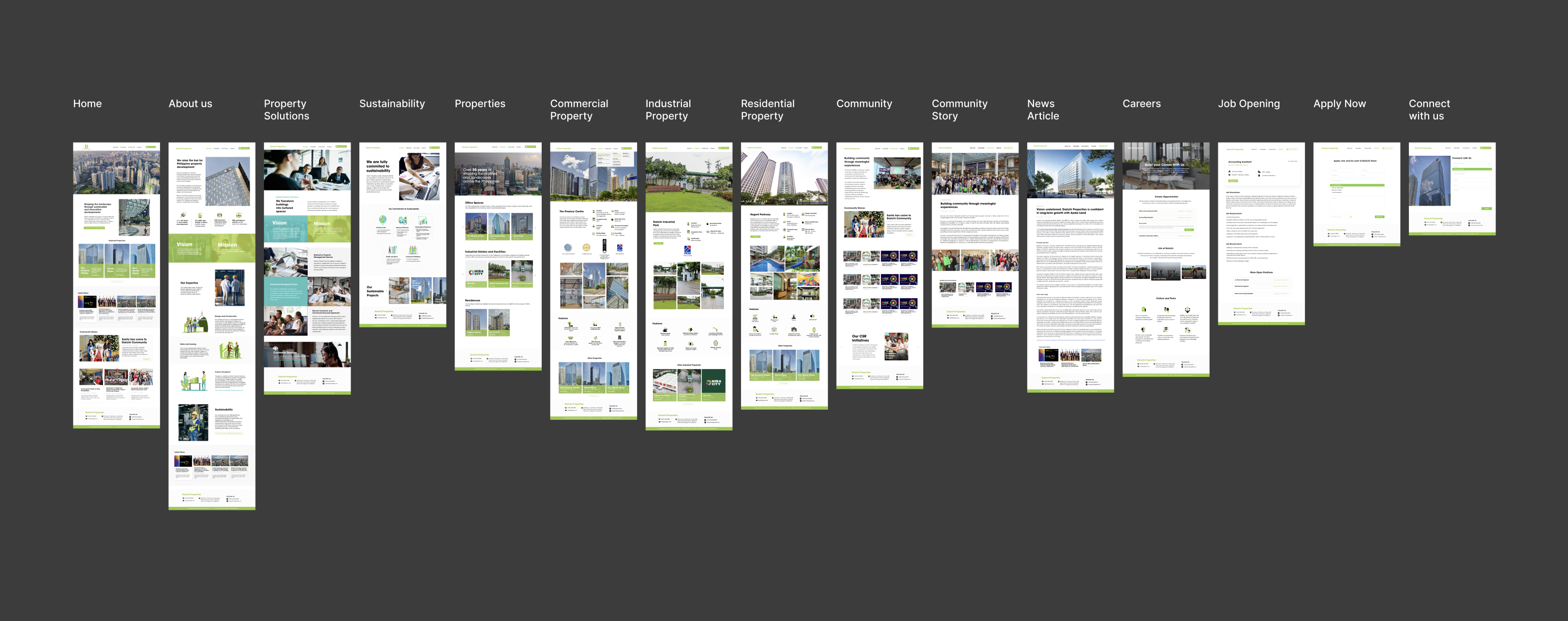
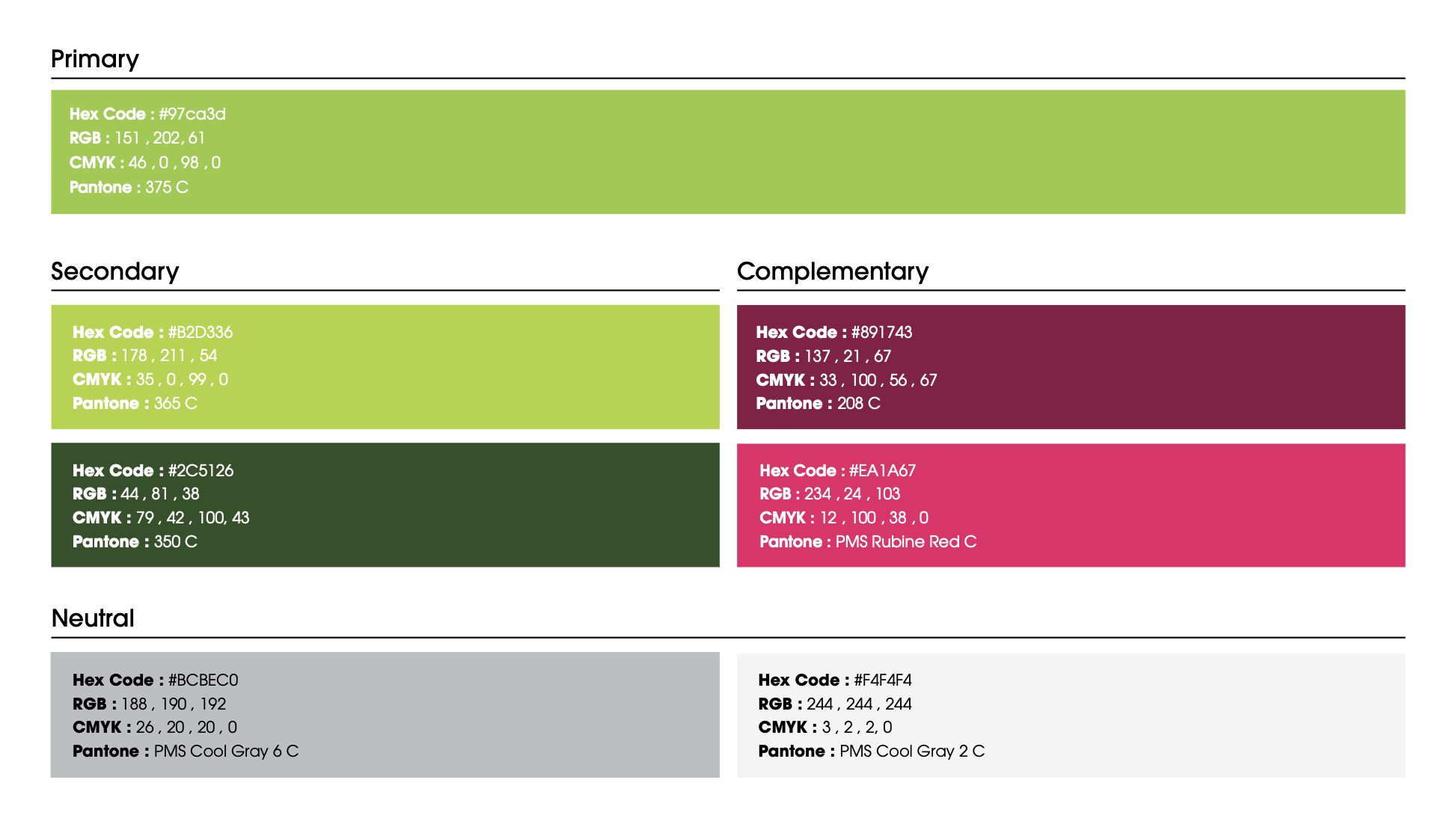
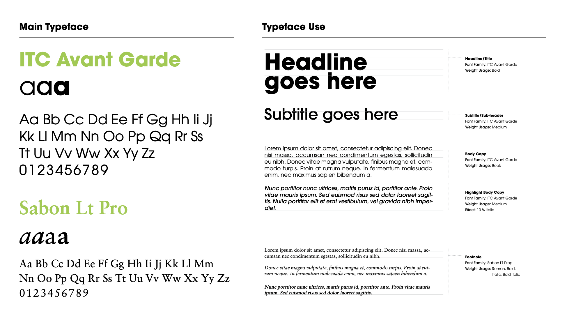
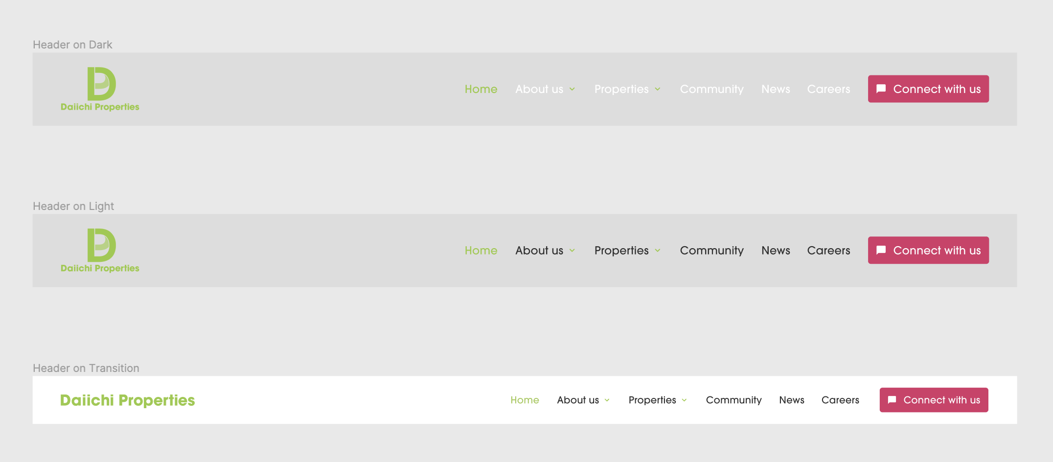
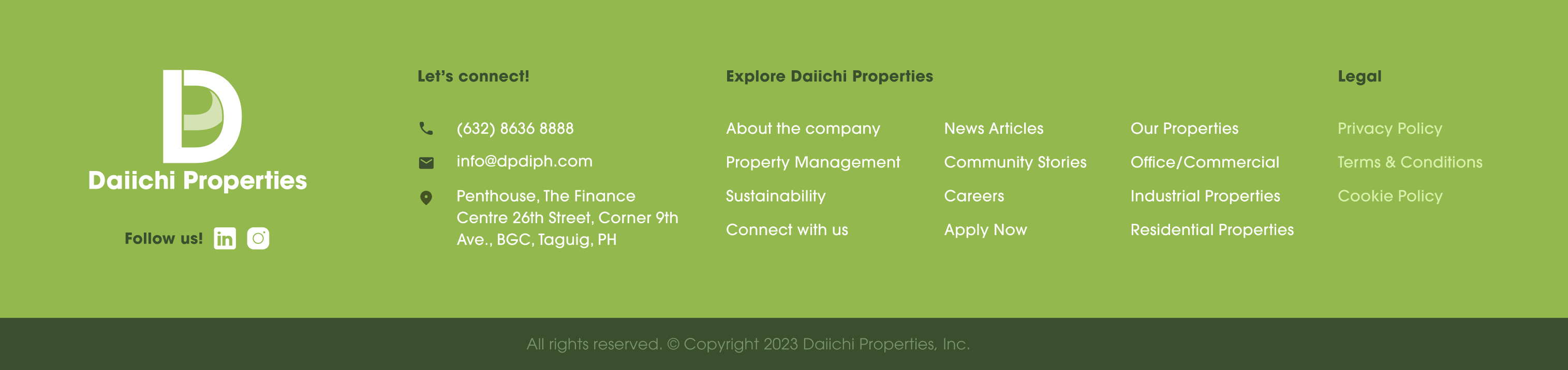
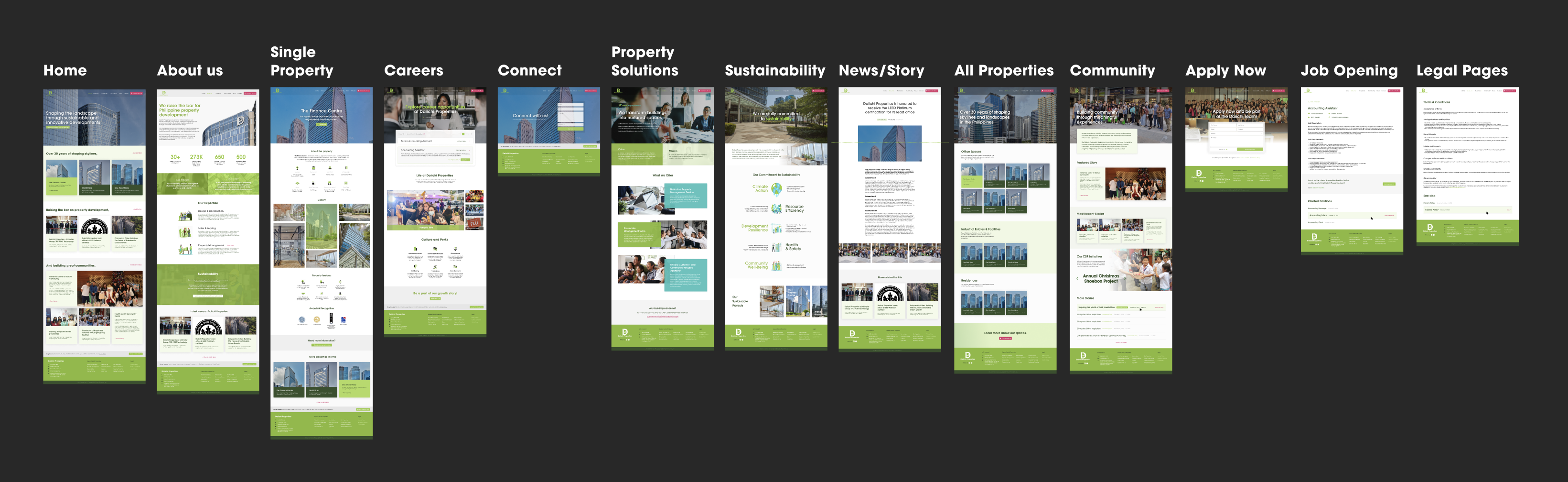
Given the existing information architecture and the client's focus on development without restarting UX research, I embarked on a step-by-step redesign. Commencing with the requested brand guidelines, my first focus was refining the header and footer.
Nav Header & Footer
Recognizing the client's imagery-rich design, I designed a translucent header to provide a seamless transition into captivating hero sections. Considering that background images may vary in color, I implemented two types of headers and a slimmed-down, fixed header on transition.
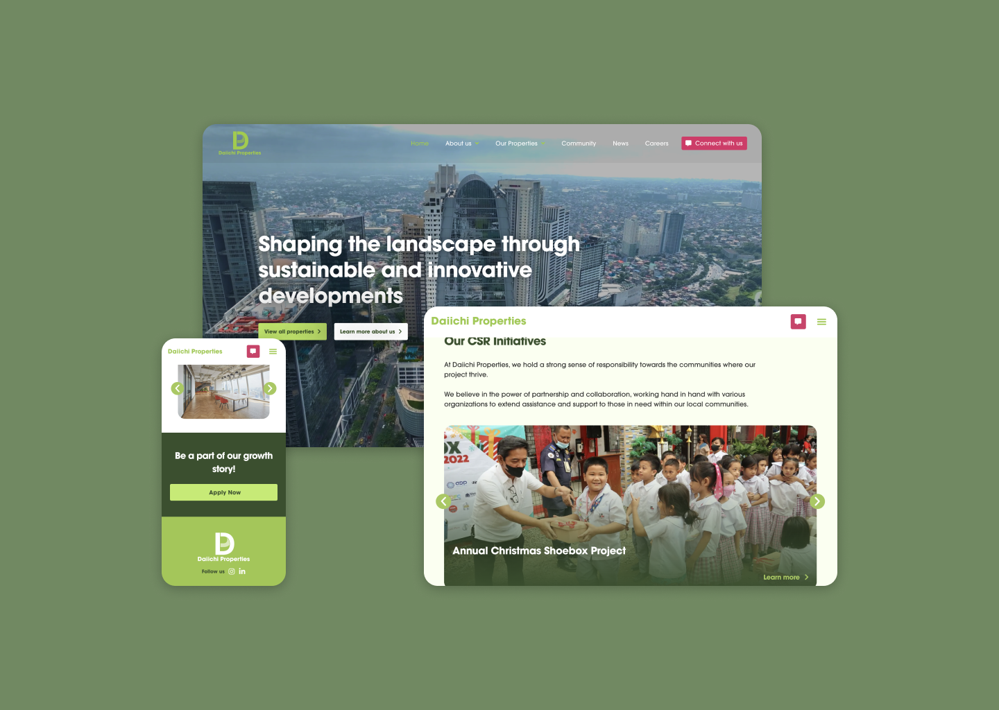
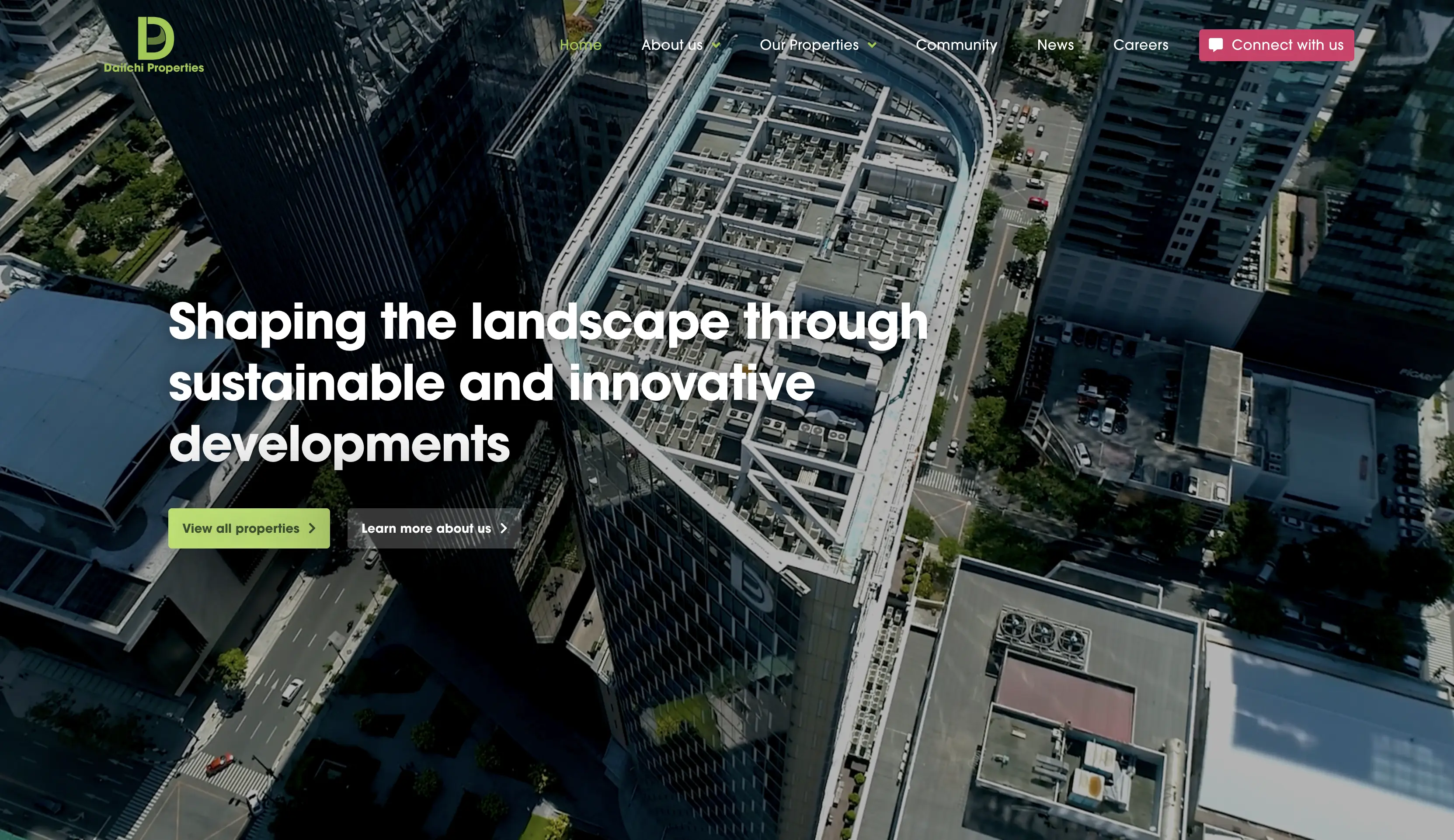
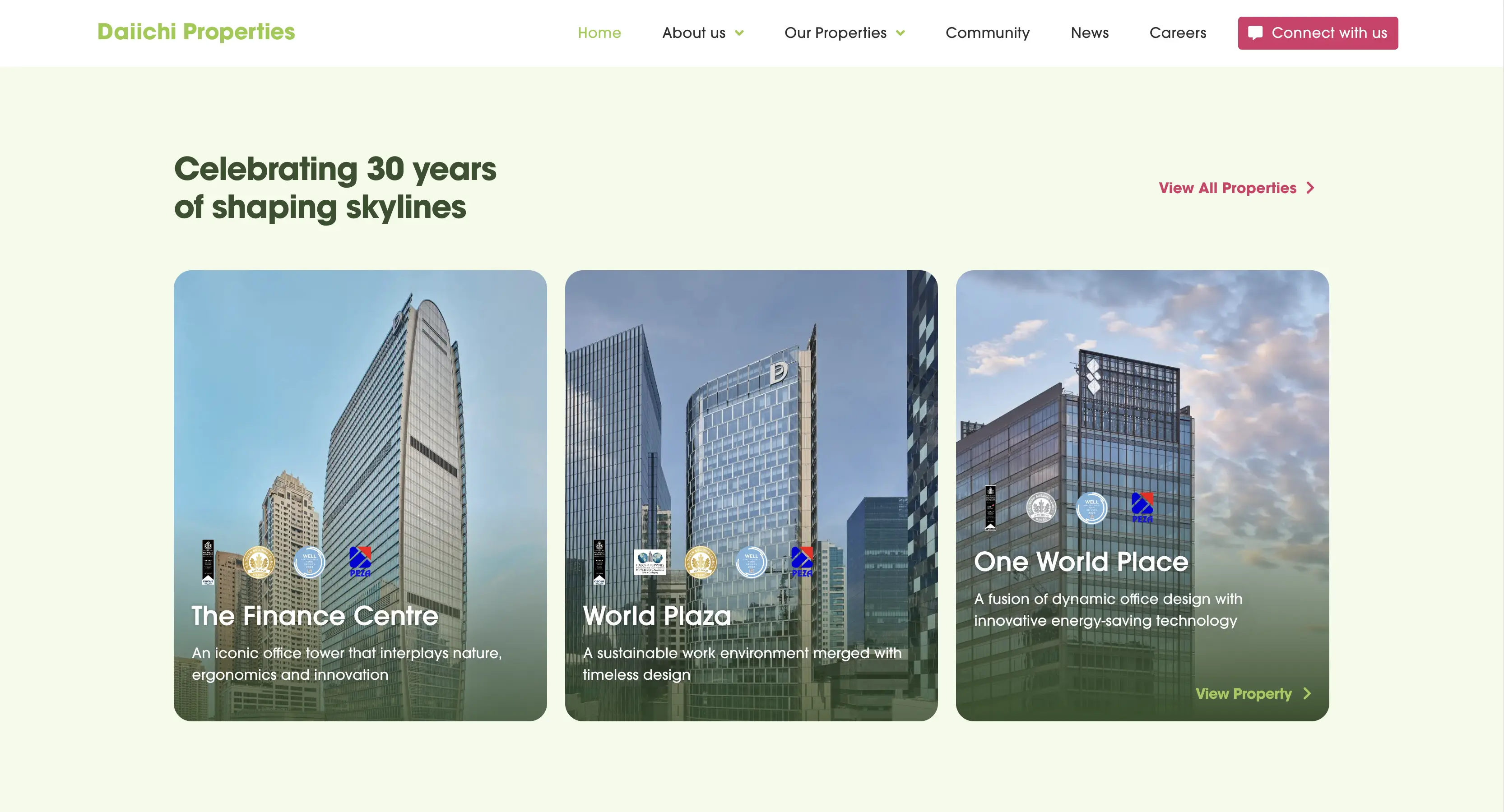
Home Page
In the hero section, I integrated heading copy directly onto images, maximizing space. A targeted call-to-action guides users to the main content—properties. As users scroll, featured properties and community stories are thoughtfully arranged for a seamless, image-centric experience.

For a more in-depth discussion on how I completely redesigned the website, feel free to set a meeting. Cheers!

We won!
The website bagged the International Property Awards: Asia/Pacific Division Best Developer Website for 2024 award! See award here.